Strategy
If the product has no interface, the brand cannot rely on one. We had to visualise intelligence that works beneath the surface – present yet intentionally unseen.
Flank’s ambition was to weave AI so naturally into legal workflows that it felt intuitive rather than intrusive. We anchored the strategy in a single metaphor: mycelium networks – nature’s silent intelligence system. Just as mycelium transmits information underground and blooms unexpectedly, Flank operates invisibly until insight is needed. The brand became a translation of that hidden infrastructure.
Execution
To make the invisible visible, we built a system that blooms – organic, intelligent, and slightly otherworldly.
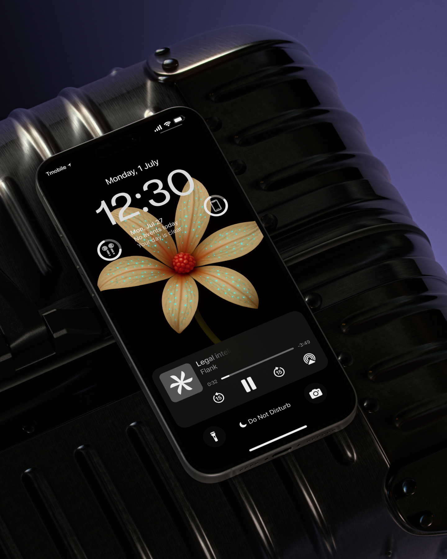
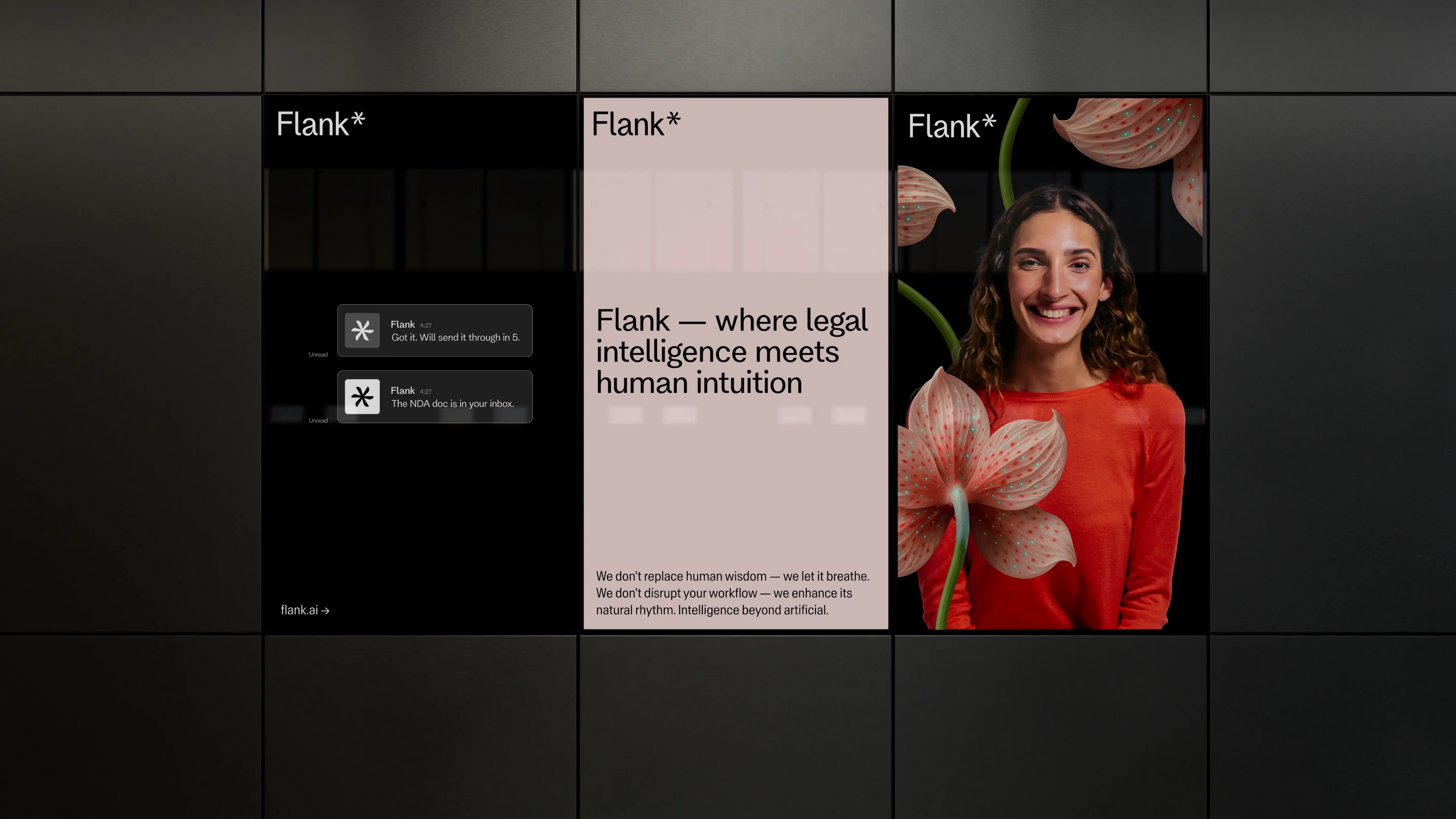
At the centre of the identity sits a series of AI-generated flowers: organic, futuristic, and symbolically rich. They represent the symbiosis between human expertise and machine learning. Crafting them required weeks of prompt engineering, refinement, and visual calibration – treating AI not as shortcut, but as medium. Typography and the logomark echo the same duality: natural yet engineered, precise yet alive.
Outcome and Credits
The brand integrates, adapts, and grows alongside its users. Following launch, Flank secured a $10M round, accelerating its next stage of growth and category momentum.
Flank emerged with a cohesive identity system capable of scaling across digital, product and IRL touchpoints. The brand reinforces its positioning as invisible intelligence – beyond artificial, embedded within the everyday rhythm of legal work.
Credits
Jake Jones & Lilian Breidenbach – Brand Vision
Frédéric Praplan – Strategy
Matts Kadlubsky, Ala Ho – Creative Direction
Ania Martowska – Art Direction & Graphic Design
Yoshiya Abiko – Graphic Design